Banner Contest

Status
Not open for further replies.
In the spirit of getting things together for ZRP we feel that we need a new banner to better depict what we're actually about. That's why in conjuction with the writing contest I'm gonna hold one for our site's top image:

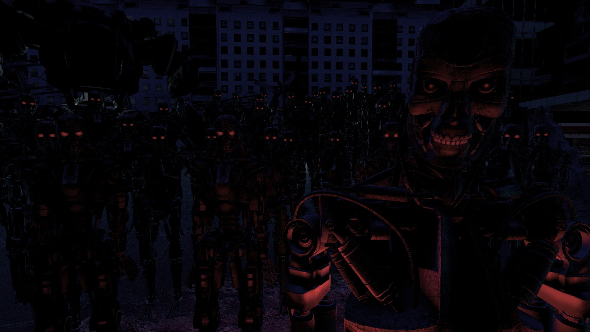
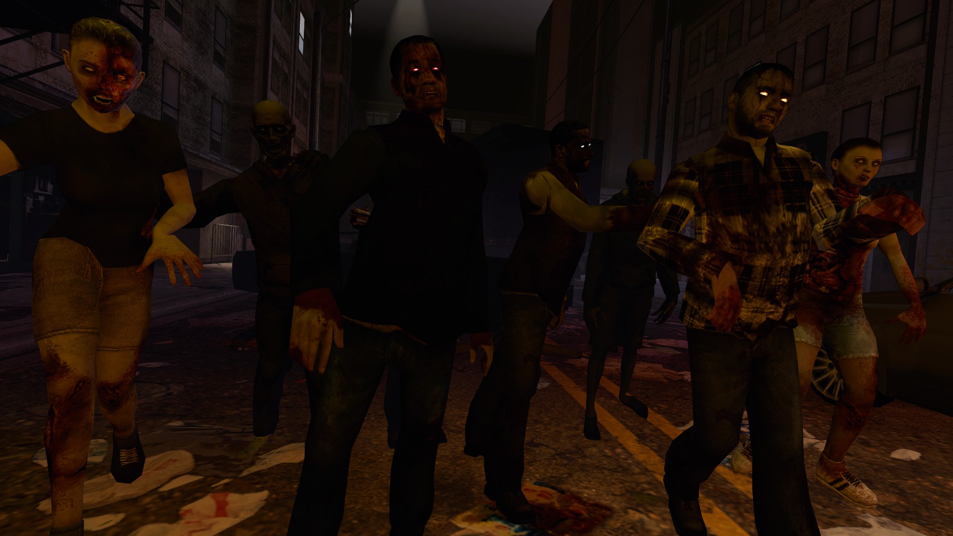
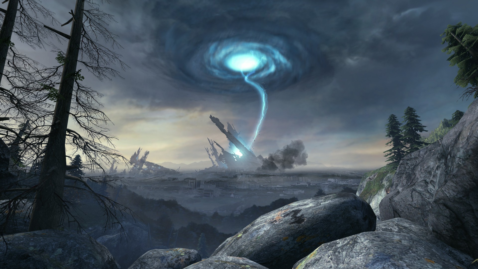
The criteria is that it has to include current and upcoming settings, meaning ZRP and PHL2, as well as TRP. It also has to be 1200 x 220. You can include easter eggs if they're subtle so be as creative as you want.​

First prize is a $60 steam game of your choosing.

Runner up prize winner gets unrestricted access to the Quiet model on any setting. I'll show you my spider pictures too.

The contest will conclude on the 25th August, upon which the administration will pick the best one.

Post your submissions here.


BRIM BONUS: SUBTLY ADD THIS PICTURE OF MY FACE INTO YOUR BANNER SO ITS BARELY NOTICEABLE AND I WILL BUY THE WINNER AN EXTRA GAME.

6TphWtv.jpg
 
Last edited:
its too dark, can't really make anything out. the trp bit on the left looks like starship troopers with the t-100 just flat-out looking like a bug, the thing in the middle might be a soldier shooting at a zombie or something but its incredibly difficult to make out whether thats actually a zombie or just a weird shape, and the guy on the far right would pass for an odst if there wasnt the metrocop helmet on the floor

its way too dark :(
 
This competition will end on the 25th August. Thank you for all the submissions so far. There's still time to enter.
 

I know that I was the one that brought up the initial complaint on the imagery for the zombie one due to the clothing but on second thought its so barely noticeable it's really not that big of a problem.

I like this one the most out of all the ones presented so far because of the colour-pallet. Blue on TRP, green on PHL2, and gold on ZRP. I feel like that'd actually go well if the ZRP admin tag was that colour because then all of these images would match with the admin colours.

I dig it.
 
cheers but that one's in the TRASH
 
love the look and seamless transition, artwork is perfect for all three, but i think that font for "serious roleplay community" needs a switchup. for some reason i get a 2010 vibe from it? otherwise, you got my vote
 
if mine got picked im gonna very much likely edit the text and some visual effects so that’s not really the final product as an fyi
 
if mine got picked im gonna very much likely edit the text and some visual effects so that’s not really the final product as an fyi

word. im bad at fonts ;(
 
is it triple post time?

i think its triple post time.

b43d77599e.png


rRrcgqC.png
 
Last edited:
im not sure how feasible it is but the color themes in necs post were a really sweet touch
im p sure it'd spice up yours aswell, but making it look decent with the current seamless transitions may be hard
slug slug
 
im not sure how feasible it is but the color themes in necs post were a really sweet touch
im p sure it'd spice up yours aswell, but making it look decent with the current seamless transitions may be hard
slug slug

yeah it doesnt look pretty with the transitions, I tried.
 
Three days and a bit of frustration later:

WE84O22.png

Thank you to @blubaugh? for color correction and @eatyobeets for the models for the ZRP portion. Everything was done by me including the posing in the background.

@brim this is what you were worried about, you're the ZRP guy!

here's the full screenshots for the backgrounds:

8609F30B71C01E50D3E1DDB7D63C12EF46F12249

9EFB95684C5F661E1EBD58F063907BEFA991C433

1226F4518583E694AB42745ACFC25A6901733A7C


a72f40b55dcbfa4d4c9e1f5050e84165.jpg
 
new banner contest lets go make it happen woo woo

i need an excuse to open photoshop again
 
Status
Not open for further replies.

Users who are viewing this thread